|
 |
||||||||||||
| Artists | Search | Resources | News/Events | Art Center | Log In | Join | |||||||||
| BUY ART |
FINE ART |
CRAFT |
GRAPHIC DESIGN |
SELL ART | |||||||||
|
|
||||||||||||
| Artists | Search | Resources | News/Events | Art Center | Log In | Join | |||||||||
| BUY ART |
FINE ART |
CRAFT |
GRAPHIC DESIGN |
SELL ART | |||||||||
Terry and Ann and Protean Pressby Jane Brenner
When I expressed interest in her work, she sent me a copy of her newest publication, Ellis Island. It is a bright blue cloth-bound book with strong red endpapers and creamy text paper. There was something satisfying about just holding it in my hand - but the title and subject intrigued me. I wanted to read this "bonny book" from Terry's Protean Press. And I wanted to interview Terry and the calligrapher Ann Miller, with whom she collaborated on this, as well as on several other projects.
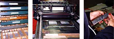
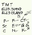
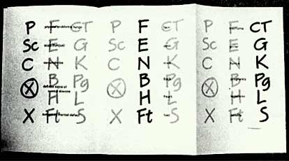
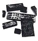
This book was written, typeset, designed, printed, and bound by Terry, a long-time FOC member. Protean Press is housed in Terry's San Francisco home: her Vandercook press sits in her garage and a nearby room holds cases of metal type, shelving for paper, and a large ping pong table, used more for work on her letterpress projects than for play. The subject of Ellis Island, inspired by Terry's visit to the museum there, is the medical inspection of immigrants and their experiences entering the United States. Chalkmarks were drawn by the doctors on the immigrants' clothing to indicate a need for further inspection for a particular physical condition. To show these in a dramatic way, Terry asked Ann Miller, another FOC member, to letter a chart of these alphabetic characters; the same kind of letters would also be used in the title. With Terry as "art director," the faxes began flying back and forth between them. Carla Tenret's 1995 AGM flyer was the original inspiration for the style of the marks. Carla and Terry had attempted to work on the design, but time constraints prevented completion of the collaborative effort. Ann chose a Speedball B nib to produce the right uncontrived character, and the marks were developed and printed in two colors, a warm clay and a deep blood red. The fold-out chart of designations with one-inch high letters complements the text which is set in Univers type. The chart letters do not imitate the look of chalk on cloth, but are expressive of the economy and directness which was the source of the letterforms.
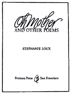
The two women first met at the 1991 Spring Retreat where Terry was seated behind Ann. At that time Terry was designing a book of her sister's poems. As she watched Ann work, it became clear that Ann was the calligrapher she needed to capture the feelings of love and exasperation in the "Oh Mother" of the title Oh Mother and Other Poems. Terry also asked Ann to create a "dingbat" for the book. This evolved into an elegant ornamental logo, which Ann composed from the two initials of the author, Stephanie Loux. The fluid brush-written marks of the title and logo, printed in a deep rust color, contrast handsomely with the stately Spectrum letterpress type.
The one finally chosen was done with Chinese brush, has a strong slant and a nice roughness to the edges, as if written on sandstone. Dark blue ink, used for the title, gives this rhythmically written word a sturdy voice. As is true of most of Protean Press's publications, Kokopelli was written, printed, and bound by Terry.
For every project Terry keeps a diary to record the process and to preserve technical information. She frequently referred to these journals during our conversation in order to recall a precise detail. With her background in English and history and her inquiring mind, Terry has the temperament and inclination for producing printed information. The subject matter is often inspired by pre-literate marks, e.g. Mayan hieroglyphs, stone-masons' marks, ancient Italian rock engravings, and the signs used by hoboes. Behind this preoccupation with the story of symbols is a letter lover whose taste ranges from stone-carved letters to inky calligraphy to wood and metal type. Ann Miller is a scribe, illustrator, and painter with a studio workshop in the center of the marketplace-a professional building in Foster City. Because she also works as a graphic designer, she uses computer programs such as QuarkXpress and Photoshop on her Mac Quadra. She enjoys outputting designs from the computer, but says, "I'm sitting there kerning, but yearning to paint a blue pear." Calligraphy is translated by photoengraving into metal and positioned on wood blocks which are "locked" into place on the press along with the metal type.
Their third joint effort, The People in the Rock, is a suite of three hand-pulled monotypes and an accompanying sheet of text encased in a portfolio. The monotypes feature images from rock engravings from northern Italy where Terry made rubbings while on an Earthwatch project. The monotypes are printed in ochre and gray with overtones of rusty red. Ann's title lettering, simple, straight-forward, and bold, accentuates the intricacy of the wiggly lines of the petroglyphic figures. As I prepare to leave, Terry dashes off to bring back a just-received piece of calligraphy for her next project, a broadside on jazz. She had asked Carl Rohrs to write the word "bebop," and when it came off the fax machine, her first response was to "give a whistle and jump in the air." There's just no telling what forms will evolve at this Protean Press.
|
|||||||||||||||||||||
|
||||||||||||||||||||||||||||||||||||||||
We wish all of you happiness and success! |